Monday, June 14, 2010

Jeff Soto 'Lifecycle' June 26-July 24, 2010


I'm excited to be showing a new group of paintings at Jonathan LeVine Gallery in just a couple weeks. My last NYC solo exhibition was back in 2007- it has been awhile and I'm looking forward to exploring New York and seeing some of my pals! If you're in town the opening is Saturday June 26, 7-9pm.

This new body of work feel like a tipping point or breakthrough to me- I've been exploring new themes, new techniques, pushing myself out of my comfort zone and possibly breaking the surface into a new direction. I usually don't feel like this but it's been a rollercoaster ride, full of discoveries and failures, emotions and hard work. This show has been more personal than those in the past, as I've had to dive into the subjects of family and life and death. It has also been extremely rewarding and I'm excited to share them. I'm going to keep painting and exploring this new path but this will be my last solo exhibit for a while. So come by if you can!

Press/image enquiries contact Maléna Seldin: malena@jonathanlevinegallery.com
For buyer's list/preview info contact Darcie Vukovich: darcie@jonathanlevinegallery.com
Everything else: www.jonathanlevinegallery.com

As an added awesome bonus, a friend and one of my favorite painters, Dave Cooper is also showing, don't miss it...


Jeff Soto
'Lifecycle'

June 26-July 24, 2010
Jonathan LeVine Gallery
529 West 20th Street
New York, NY 10011

Thursday, May 27, 2010

Jeff Soto "Lifecycle" sneak peek


Here is one of the new paintings. Click on the image for a larger shot. My show opens in a month, Saturday June 26th, 2010. Jonathan Levine Gallery, NYC.

Friday, May 21, 2010

Pearl Jam NYC poster

I did a gig poster for Pearl Jam's Madison Square Garden show last night, and thought I'd share my process in here. This print seems very polarizing (hmm, kinda like my LOST poster) among PJ fans, they either love it or hate it. I have designed many screenprints over the past 8 years, but this was my first gig poster and it's a different beast for sure. It's been fun and I hope I get the opportunity to do more. Thanks go out to Mr. Siglin who made it happen and my friend MAXX242. You guys rule.

I've found that all screenprint artists set things up differently. It's tough to find a good how-to online, especially looking for 100% hand drawn. There are plenty that show the actual screen printing process that are pretty cool, but I was more interested in seeing an artist's process- what do they ink on? How do they deal with multiple colors? How do they scan in their work?

So I thought I'd show how I have been working. It's a mix of old fashioned hand drawing and Photoshop. Most artists today are using Wacom tablets and for many the art is completely digital. I got a Wacom after I made this print, and I see it's going to be very helpful, but I think I still prefer to draw the old fashioned way. Nothing like a sharpened HB pencil grinding away on paper!


1. Brainstorm- I treated this job as more of a fine art project than an illustration. Listened to some Pearl Jam, and started drawing. New York City. So glad I was asked to do the NY show. I love the place. Never lived there, but visited enough that I feel comfortable there and I know my way around (except I still get lost on the western side of Greenwich Village- no grid!!). I wanted to show a piece of NYC that was recognizable but not so epic. No Statue of Liberty, no Empire State Building. Hmmm...

During one of my earlier visits to NYC, we stopped by an internet cafe at Astor Place several times a day for a week. I saw this awesome cube sculpture and a bum sleeping under it. It was dirty and dusty and had tags on it. Everyday I saw it it seemed to change. I finally saw someone turning it! Holy shit! I still smile when I turn a corner and see the cube. That sculpture holds a special little place in my heart and I know many NYers love it as well. The cube had to be in the poster, it is a subtle reference, like, if you're not from NYC, you probably don't recognize it. The rest was just exploring my Sotofish character. And I wanted to do the teeth as letters so I went for it. Pearl Jam seems to have a pretty quick and easy approval process. They were down so I started working on the final.


2. Linedrawing- I think this is sometimes called the "key line", it is basically the outline that ties the whole image together. I enlarged my rough sketch to 18" x 24" on the computer, and printed it onto four 8.5 x 11" sheets and taped them together. Then I taped a large sheet of Bristol Vellum over that and began to ink it on the light table (above). Took me longer than I thought it would- over two days to finish it. I can paint faster than I can draw. I was pretty happy with it, though the supporting band was changed later. Outline finished (below)

3. Shading and highlights- Next I took that first line drawing and taped a large sheet of marker paper over it. Marker paper is thin and very transparent and does not bleed at all, so the lines are very smooth. This is where you have to start planning- how many colors? What order should the colors be printed in? I prefer to figure it all out ahead of time and hopefully make it easy for the printer. I tend to think like a painter even doing screenprinting, so I know I'd like a shadow and some dimension. I did a big drawing of the shadows, highlights and fill for the Cube, shadows on the ground, and shading for the teeth. There were about 10 drawings that I then needed to scan in.


4. Scanning and assembly (kill me)- The scanning was the most difficult part, it is hell taking an 18" x 24" ink drawing and scanning it on a letter sized scanner. There were 8 segments that did not want to line up, luckily I know a trick or two. The real problem then becomes scanning all the other drawings and getting everything to line up. I did end up doing a lot of small correcting with a mouse, this will be much easier with the Wacom. I always work larger than needed, so this file was 18 x 24" at 400dpi, and it was all done in Photoshop.


5. Colors- colors have always been an easy thing for me while painting. But limit my color palette and I find it much harder. I enjoy that aspect of screenprinting, I like the challenge, but I think I still have much to learn. With every print I do, and with seeing other prints from artists I admire, I'm learning some of the tricks. Like shading using a layer that's bitmapped. Or using transparent inks to make different colors. I didn't know about those methods while working on this one. I will try them for sure, but I also like the look of strong solid graphics. It reminds me of 80's skateboard decks or something. My paintings are so dimensional, I like the challenge of breaking that into a few colors for screenprinting. If I do shading in these prints would I be better off just making a painting?


6. Final- colors are picked, all the layers are looked at and checked for out of place marks, and it's uploaded to the printers. Took a week to finish this. Half of that time drawing, half on the computer. I could have finished a large painting in that same time. I learned a lot, and the next print I finish is much easier.

Last week I got the box, opened it and the prints looked better than I expected.

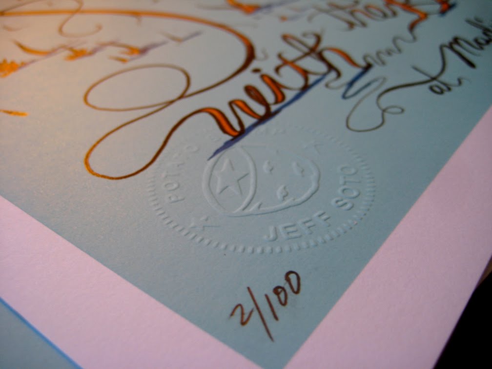
Just finished signing and stamping! For sale in the near future...... email me to get on my mailing list jeff@ jeffsoto.com

Wednesday, May 19, 2010

LOST poster- Claudia's Skull

This is a secret print that I only told a few loved ones about. Didn't know it was coming out today, this is one of those "three screenprints a week" weeks I guess. I love LOST, and am looking forward to seeing how it all ends!

I had the episode "Across the Sea". The big thing that stood out was Jacob and MIB's mother, Claudia being brutally murdered by "Mother". Cracked her skull with a rock, and stole her babies. MIB and Jacob were created out of Claudia's death.

Here are some pics of the actual drawings. Someday I might work more digitally, but for now call me old fashioned...


I will have some of these for sale later on down the road. Signed and numbered... stay tuned...

Tuesday, May 11, 2010

Sotofish1 Print


"Sotofish1", 22" x 30" paper size, 6 color screenprint, signed and numbered edition of 100. Comes with signed and numbered COA. $70 + shipping

Available Tuesday May 18, 2010 noon PST, at www.potatostamp.com

Though it could end up being a real headache for us, we're going to make available the same edition numbers on future print sets to those who purchase this first print. For example, if you end up with #22/100, we will let you have the option of purchasing #22/100 of the Sotofish2 print, whenever it comes out. No obligation of course, but we want to make it easier for those interested in collecting them all.

For the background on this print set, please go to Jeff's last blog entry: Sotofish Story

Thanks,
Jeff and Potatostamp staff

Tuesday, May 04, 2010

Sotofish1 Print- background and sneak peek


My best friend in third grade, Dwayne Britton sometimes called me "a little sotofishy" in a fake British accent (his accent was actually pretty damn good for an 8 year old). The nickname lingered for a while and in 6th grade stuck. People started calling me Sotofish.


I enjoyed having a nickname, even more so that is was completely nonsensical. Sometime in 1986 I developed a character and called it the Sotofish. It had pointy, triangular ears, a circular face and a wide grinning mouth of teeth- always with one distinct gold tooth. I realized only recently that the round shape and ears were directly inspired by seeing graffiti along the 5 freeway in L.A.- the L.A. rivercats. I must have seen these as a 9 year old and kept it stored away in my brain for a while. The Sotofish appeared on all my school notebooks and peachy folders, I frequently "tattooed" it on myself and my little brothers and I drew it on the white circle logo on my duct taped Converse All-Stars. I spray painted it in skate spots before I knew what graffiti was, and as the graphics smeared off my skateboard, I would paint the Sotofish using whatever model kit enamels I had in the garage.


It was my first creation that felt completely original to me. It was my own symbol, and an early form of self portraiture. It takes me back to the past, not only my early days of discovering art, graffiti and skateboarding, but the youthful days of trying to make sense of the world. The Sotofish has been appearing in my paintings the last few years, and I decided to make a new screen print- Thee definitive Sotofish print!

This is actually the start of a print set. The first print, "Sotofish1", is basic and iconic, the start of a story (think of Jim Phillips' famous Rob Roskopp decks and the progression it showed). I'm planning on completing 4-6 prints in this set, with each print getting more complex with technique and number of colors. The first print is 6 colors, and the final one could be 25-30. All will be editions of 100, on 22" x 30" paper. Sotofish1 drops in a few weeks. Here is a sneak peek:

Wednesday, April 28, 2010

Monday, March 29, 2010

Miami 2009

Another year of Art Basel Miami craziness. Another year where I post this stuff three+ months late! I guess it's better late then never. I had over 600 pictures to go through, so it took a while to figure this one out.

Got to see the Salton Sea on the way out. Thing is massive.

When I got to Miami I found that my paint had emptied out in my suitcase, luckily I zip locked em', but man, three bags of paint exploded, put a damper on some of my painting plans.

First night met up and hung out with the Jonathan Levine Gallery staff, went to Primary Flight (the exhibit) in Miami Beach, got some dinner, and ended up at the Max Fish pop up bar. Eric White was there, Mr. Levine, Carlo McCormick, Tristan Eaton and a whole slew of other characters.

Next morning slept in a little, watched the manatees down below in the lagoon and picked up my friend from the airport. Went to a couple art fairs, found Dabs and Myla and some giant seed pods. Miami is kinda crazy, always weird shit to see..


Some art, Dave Cooper, Doze, Maya Hayuk, etc… a few of my watercolors I exhibited...


Next morning got started on my mural. Primary Flight hooked it up, got me a nice wall and supplied us with some paint. Even had access to scaffolding which was very appreciated. One of the highlights of my trip was getting to meet (and get photographed by) Martha Cooper. For those in Miami it is at 6th and 2nd. streets.Finished in one long day. Painted until it was dark. Probably could have done more, made it more intricate. I was planning on coming back the next day but so much of my paint was emptied and besides, I was happy with it when I saw it in the daylight. Tristan Eaton was painting on the other side, he put in a lot of hard work and several days! End of the evening burger was pretty good, even though I ate all the paint off my fingers too.


Third day we checked out my mural, looked finished to me, besides, it was raining. So we headed out to the Everglades. Didn't realize it was so close to Miami. It was nice to get away from all the visual overload and take in some nature. Such a different world from all the saturated graffiti and urban ugliness that is the Wynwood district. I got very close to a couple alligators, very dumb, I didn't know how fast they were. Luckily, they were sluggish or maybe just liked me. Saw some giant spiders, jumping gators, and got rained on and then ate some traditional Florida cuisine. Frog asses and alligator nuggets.


Part 2 coming soon...